Layout Wireframes
Explore our curated collection of responsive templates and modular components designed for high-performance web environments.
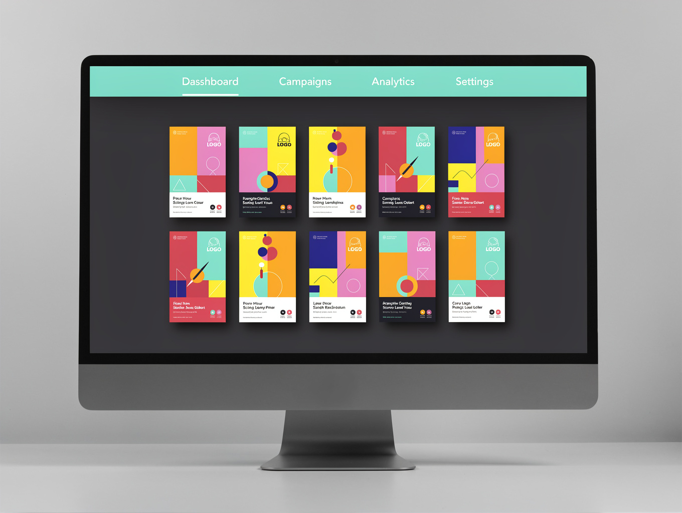
Media Grid Layout
Responsive grid system for high-density content display and visual asset management.

Content Feed Module
Dynamic feed component for real-time updates, blog posts, and news aggregation.

Data Dashboard Shell
Structured dashboard interface for telemetry, metrics, and performance monitoring.
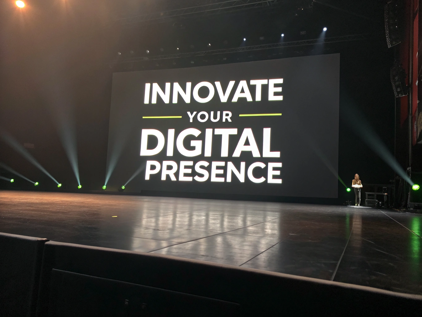
Hero Feature Block
High-impact hero section for primary messaging and platform positioning.
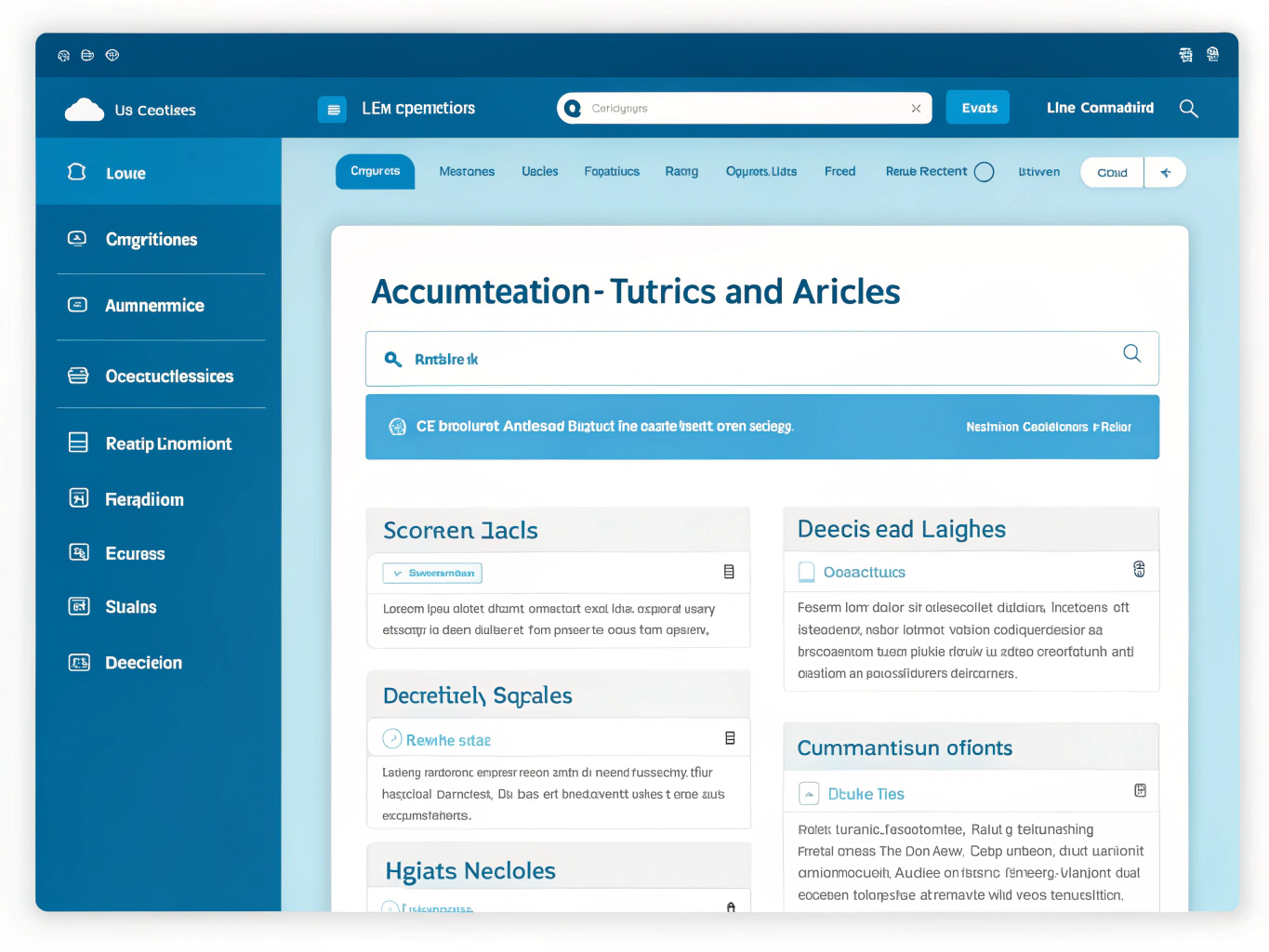
Documentation Hub
Structured documentation layout for technical guides and API references.

Interactive Sandbox
Live preview environment for testing components and layout permutations.
Need custom wireframes?
Vortex supports custom HTML, CSS, and modular component integration.
Responsive Testing Presets
Calibrated hardware dimensions and layout constraint profiles engineered to stress-test breakpoint continuity across physical screens.
Foldable Devices
xs: @container (max-width: 360px)Mobile Handsets
sm: @media (min-width: 375px)Tablets & Hybrids
md: @media (min-width: 768px)Portables & Laptops
lg: @media (min-width: 1024px)Standard Desktop
xl: @media (min-width: 1280px)Extended Canvas
2xl: @media (min-width: 1536px)