Web Architecture

Layout Wireframes

Explore our curated collection of responsive templates and modular components designed for high-performance web environments.
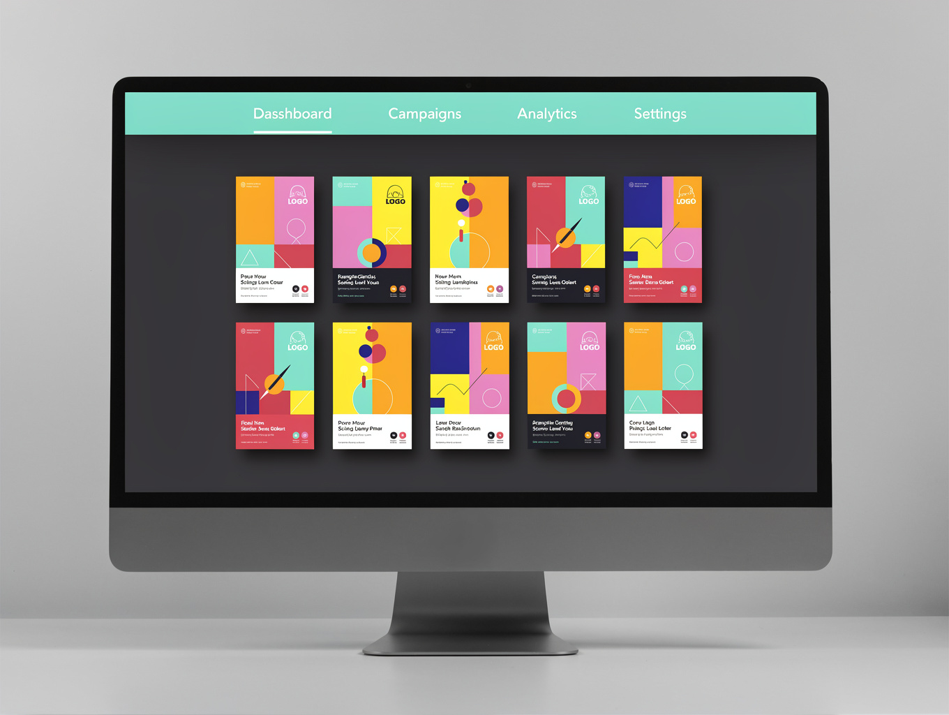
vortex.io/media-grid
Media Grid Layout
Layout

Media Grid Layout

Responsive grid system for high-density content display and visual asset management.
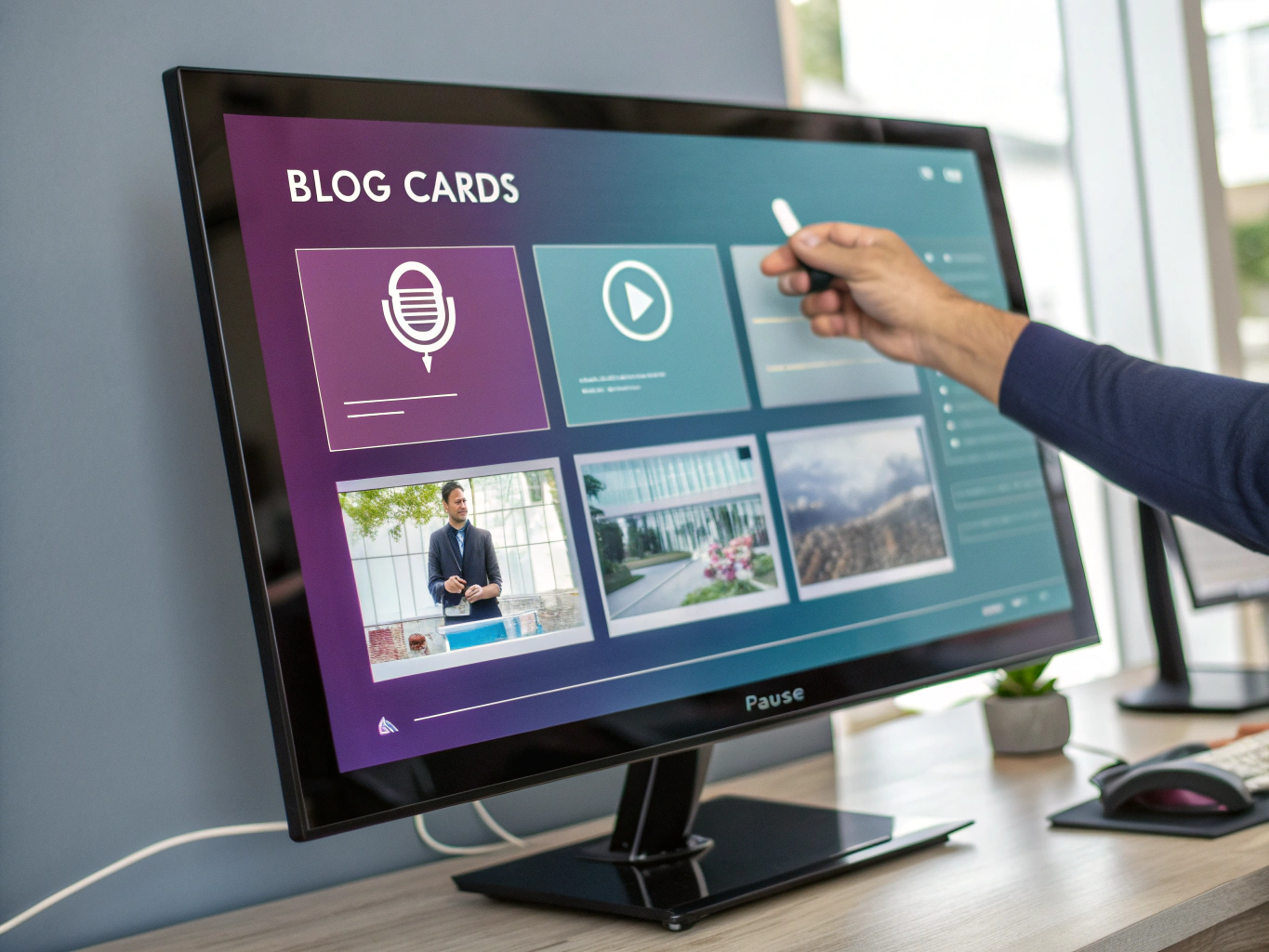
vortex.io/feed-module
Content Feed Module
Module

Content Feed Module

Dynamic feed component for real-time updates, blog posts, and news aggregation.
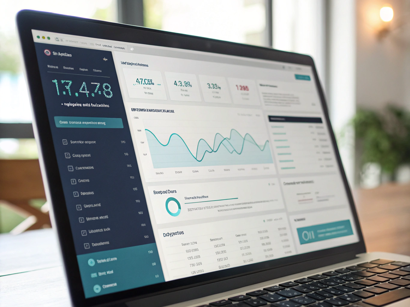
vortex.io/data-shell
Data Dashboard Shell
System

Data Dashboard Shell

Structured dashboard interface for telemetry, metrics, and performance monitoring.
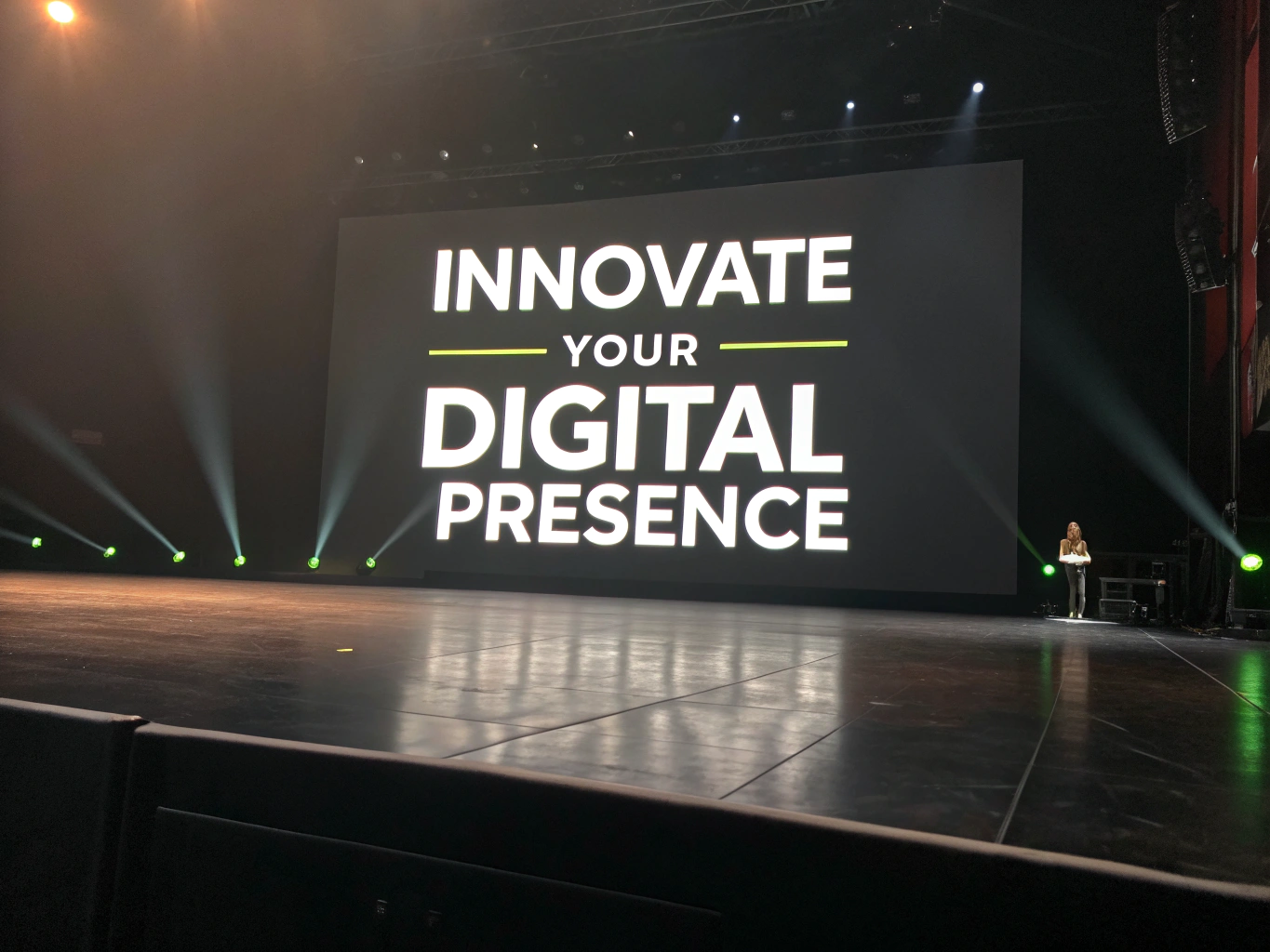
vortex.io/hero-block
Hero Feature Block
Display

Hero Feature Block

High-impact hero section for primary messaging and platform positioning.
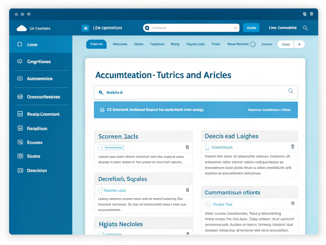
vortex.io/docs-hub
Documentation Hub
System

Documentation Hub

Structured documentation layout for technical guides and API references.

vortex.io/sandbox-ui
Interactive Sandbox
Tooling

Interactive Sandbox

Live preview environment for testing components and layout permutations.

Need custom wireframes?

Vortex supports custom HTML, CSS, and modular component integration.

RUNTIME ENGINE: VIEWPORT MATRIXVERSION 2.4.0

Responsive Testing Presets

Calibrated hardware dimensions and layout constraint profiles engineered to stress-test breakpoint continuity across physical screens.

280px – 360px

Foldable Devices

Compact Folding
Dual-screen hinge testing & extreme narrow portrait queries
RESOLUTION320 × 740 px
RATIO: 21:9 / 4:3 splitPASS: 99.4%
xs: @container (max-width: 360px)
375px – 430px

Mobile Handsets

Modern Smartphone
Dynamic island margins, notch safe-areas, and thumb-zone ergonomics
RESOLUTION393 × 852 px
RATIO: 19.5:9PASS: 99.9%
sm: @media (min-width: 375px)
768px – 834px

Tablets & Hybrids

Adaptive Slate
Split-view navigation drawers, orientation shifts, and tap targets
RESOLUTION820 × 1180 px
RATIO: 4:3 / 3:2PASS: 98.8%
md: @media (min-width: 768px)
1280px – 1440px

Portables & Laptops

Compact Workstation
Fluid grid flex transitions, multi-column trays, and trackpad scaling
RESOLUTION1366 × 768 px
RATIO: 16:10PASS: 99.7%
lg: @media (min-width: 1024px)
1920px – 2560px

Standard Desktop

Retina Display
High-density asset hydration, macro typographic rhythm, and fixed sidebars
RESOLUTION1920 × 1080 px
RATIO: 16:9PASS: 100%
xl: @media (min-width: 1280px)
3440px – 5120px

Extended Canvas

Ultrawide Monitor
Maximum content constraint limits, edge letterboxing, and pan controls
RESOLUTION3440 × 1440 px
RATIO: 21:9 / 32:9PASS: 97.2%
2xl: @media (min-width: 1536px)

Custom Viewport Emulation

Drag responsive canvas handles directly in the live sandbox to simulate non-standard container queries.